How about an interface concept for a change? What you can see below is the Mynokiablog.com quoted. Well, he made a custom version of Windows Phone 7 for Nokia devices, keeping the basics of the Metro UI, but adding that tiny extra that missed – another dimension.
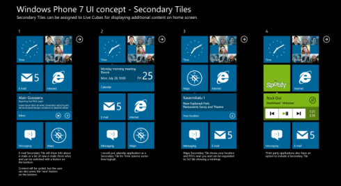
Tiles were direct Cubes Live with equatorial 4 pages to go, each with an option for the main tile available. Peter is also considering secondary tiles, showing new strength Master Cube and occupy two seats instead of one, or perhaps even more, as shown below. There is an arrow pointing to more details on the main pane. more images after the break...
And finally, something I thought was really ingenious: a long press on a Live Cube turns the other cubes around it into additional features for the one you pressed. For example, holding the Internet Explorer Mobile pressed reveals cubes around it with bookmarks, pages you visited and other such options. The same probably goes for Zune and your playlists.
This doesn’t change the Metro UI look, but its functionality, so it’s brilliant.


0 kommentarer:
Post a Comment